Project Objectives
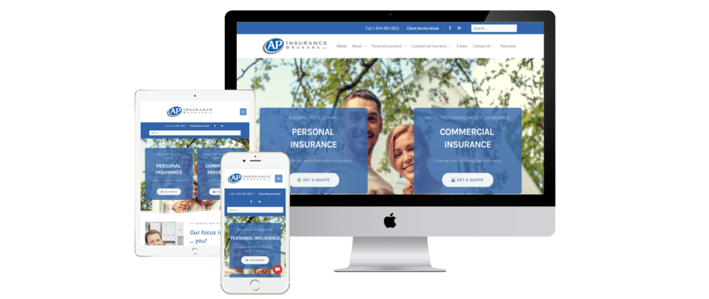
To build a visually appealing website that is easy to navigate by their residential and commercial customers.
Target Audience
Residential and commercial insurance customers
Concept
As an already established insurance company in Ontario, this website redesign needed to be built from the ground up starting with the organization of its content and how to present specific information to both target audiences, residential and commercial customers.
Design Issues (Overview)
One of the major design issues that we had to solve is how to build a unified website for two different audiences, and how to guide their customers from the homepage to the appropriate information they are seeking.
Design Process (Overview)
All content was collected and organized into three separate sections: residential products, commercial products, and general company information. The website’s sitemap and the path each target audience took to get to the desired information was carefully planned and drafted. Consideration of the company’s branding was also implemented for consistency throughout the entire website.
Outcome/Results
The new website was well-received by their staff, partners and customers. Analysis of the website traffic shows the established paths to the requested content were successfully followed. Decrease in bounce rate can also be attributed to content organization and navigational changes.
February, 2021