Project Overview: When Expertise Is Hidden Behind Complexity
Insurance brokers operate in a space where products are complex, options are numerous, and trust is essential. Clients are not simply choosing a provider. They are trying to make sense of risk, coverage, and long-term protection.
In this case, the client had the expertise to guide their customers effectively. However, their website did not reflect that capability.
The challenge was not a lack of information. It was how that information was presented. The website needed to move beyond listing services and begin guiding users toward understanding and action.
This project focused on transforming the website into a system that simplifies complexity and supports client decision-making.
The Business Problem: Information Without Direction
At a surface level, the website contained the necessary information about services and offerings. However, it lacked structure.
Visitors were presented with multiple options but no clear pathway to follow. This created confusion rather than confidence.
In industries like insurance, too much unstructured information can be just as problematic as too little. When users are unsure about what they need or what to do next, they are more likely to delay or disengage.
The website was not failing because of missing content. It was failing because it did not guide the user.
The Strategic Insight: Clarity Reduces Risk for the Client
The key insight behind this project was that clarity is one of the most valuable assets in insurance marketing.
Clients are already navigating uncertainty. If the website adds to that uncertainty, it increases hesitation.
A well-structured website should do the opposite. It should simplify choices, explain options clearly, and guide users toward the most relevant solution for their needs.
This means the role of the website is not just to inform. It is to translate complexity into clarity.
The System: Designing a Guided Decision-Making Experience
To address this, we developed a system centred on how clients evaluate insurance options.
The first component was service clarity. Each offering needed to be clearly defined, with language that focused on outcomes rather than technical details.
The second component was structured navigation. Users needed a clear path from initial interest to inquiry. This required organising content in a way that reflects how decisions are made.
The third component was conversion alignment. Calls to action were designed to match user intent, whether they were exploring options or ready to request a quote.
By aligning these elements, the website became a tool that supports decision-making rather than complicates it.
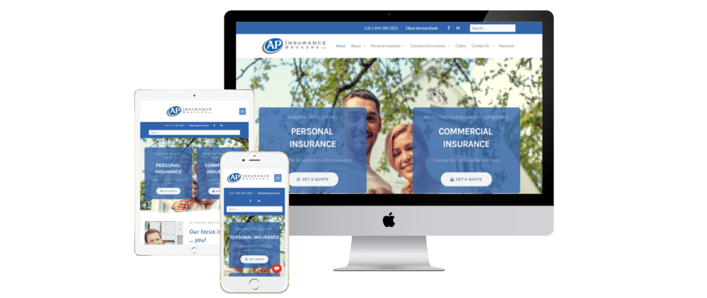
Execution: Translating Strategy Into a Functional Website
The execution phase focused on simplifying the user experience while maintaining depth of information.
The website was restructured to prioritise clarity. Content was rewritten to focus on what clients need to know, rather than what the business wants to say.
Navigation was streamlined to reduce cognitive load. Users could quickly identify relevant services and understand the next step.
Calls to action were integrated throughout the site to guide users naturally toward inquiries and consultations.
Visual design reinforced professionalism and trust, but always served the broader goal of clarity and usability.
Results: From Confusion to Conversion
The transformation of the website led to a more effective client experience.
Visitors were better able to understand their options and take action with confidence. This reduced hesitation and improved engagement.
The client gained a website that functions as a lead generation tool rather than a static information source.
Most importantly, the business was able to present its expertise in a way that aligns with how clients make decisions.
What This Means for Your Business
If your business operates in a complex industry, your website plays a critical role in how clients perceive and understand your services.
Providing more information is not always the solution. Without structure, more information can create more confusion.
By focusing on clarity, guided navigation, and aligned calls to action, you can turn your website into a system that supports both understanding and conversion.
This is especially important in industries where trust and decision-making are closely linked.
Strategic Takeaway: Simplicity Is a Competitive Advantage
The key lesson from this project is that simplicity creates confidence.
When you remove unnecessary complexity and guide users through a clear experience, you reduce hesitation and increase the likelihood of action.
A website should not mirror the complexity of your industry. It should simplify it for your audience.
If your current website feels overwhelming or underperforms in generating leads, the issue may not be your services. It may be how those services are structured and communicated.
That is where strategy creates measurable results.
February, 2021